Eğitim · LGS hazırlık
FNM Akademi
A promo and pre-registration site for an exam preparation centre. The copy speaks plainly to parents and the contact steps are short.
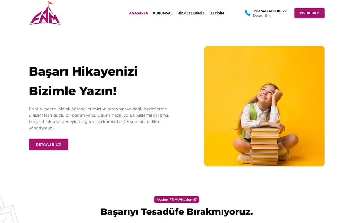
FNM Akademi provides training and consultancy. The site runs on four headings: home, about, services and contact.
The real question on an education site
Visitors to an education site first want to know whether they can trust the institution. So I gave the about section more space than the service list. Who teaches and how much experience they have comes first.
What the site does
Service and programme pages
An application and enquiry form (8 fields)
Location on Google Maps
A WhatsApp line
A rotating introduction on the home page
An Instagram link
Why location matters
For a school that teaches in person, the map is part of the decision. Nobody enrols before they know they can get there.
That is why the map is in plain view instead of at the bottom of the contact page.
WhatsApp instead of a form
Most questions about courses are one sentence long: "When does this programme start?" or "How much is it?" Filling in a form for that feels like too much, so people message on WhatsApp.
The form is there for more serious applications. Each one covers a different need.