Perakende · Çocuk giyim
Limon Çocuk
Online shop for a kidswear store, with simple size and colour options. Parents mostly shop from their phones, so I designed the mobile flow first.
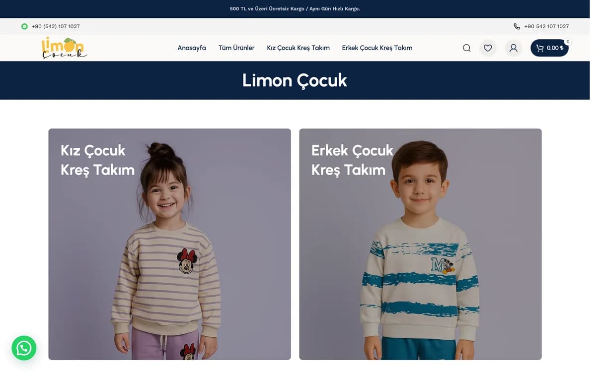
Limon Çocuk makes nursery outfits for children. The range is small, so I kept the site just as simple.
Four menu items
The menu has home, all products, girls' nursery sets and boys' nursery sets. Visitors already know what they want, so there is no point walking them through a category tree.
A deep menu over a handful of products is an attempt to look bigger than you are. It usually backfires, because visitors keep landing in empty categories.
A product page written for parents
Parents buy these, and their questions are predictable: what the fabric is, what age it fits, whether it shrinks and whether it is soft. The product page answers all four on the first screen.
The size chart is on the product page. On a separate page it takes the buyer away, and some never come back.
What the site does
Cart and checkout
Product search
A 12-field checkout form including address and delivery details
Category structure split by girls and boys
Simplicity in checkout
The checkout may look long, but most of the fields are the delivery address. Nobody has to register, and guests can complete the purchase.
Making a one-off buyer create an account is one of the most common reasons people abandon a cart. The account offer comes after the order is placed.